
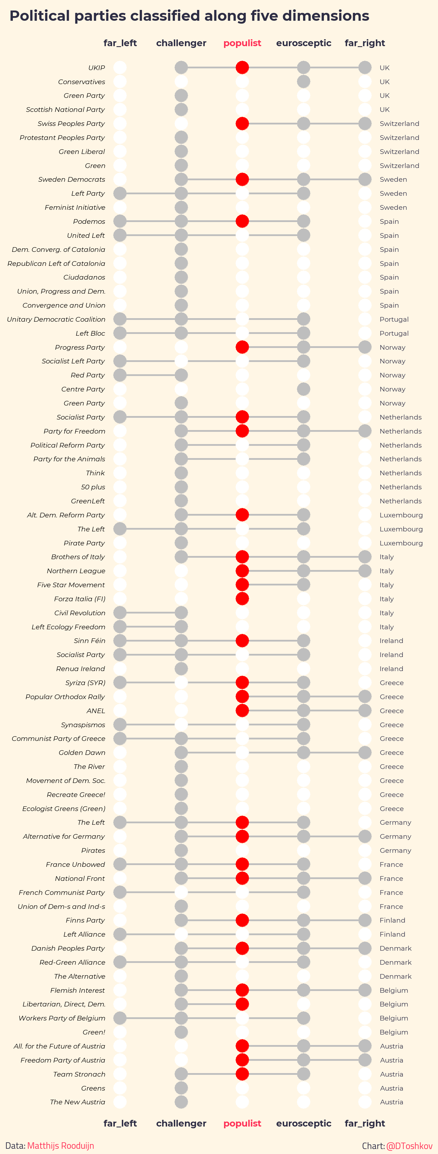
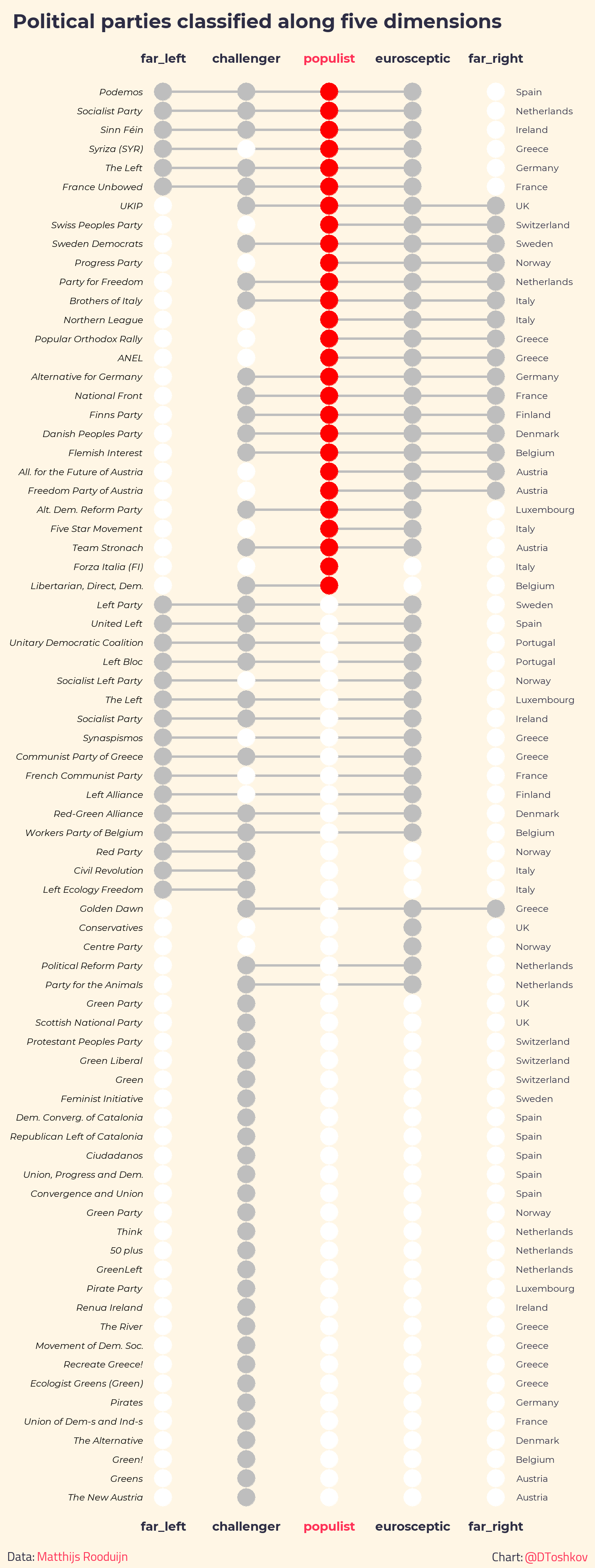
Visualizing categorical data is difficult. Especially when we are interested in showing how a large number of units are distributed across multiple categories, things get usually quite messy. Venn diagrams are a gret visualization tool, but do not work well for more than four categories.
To explore something new, I redid a diagram of political parties, originally published by Matthijs Rooduijn in the European Journal of Political Research. My approach easily generalizes to more cases and more attributes. I was inspired by the R package UpSetR, which however focuses on the distribution of attributes across the cases and not on the cases themselves. Here are two versions of the resulting graph, one sorted by party attributes and one sorted by country: warning, the graphs are long, and there is more text below!
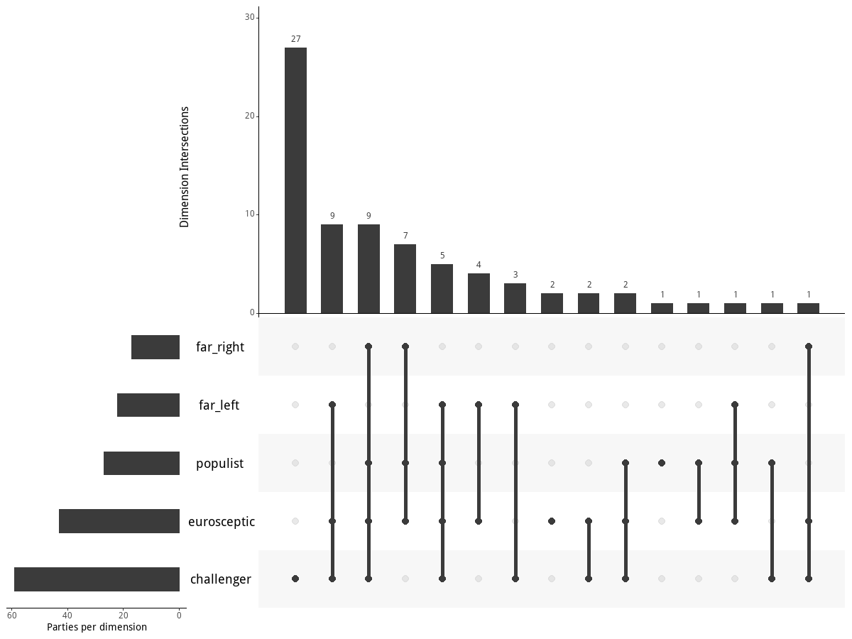
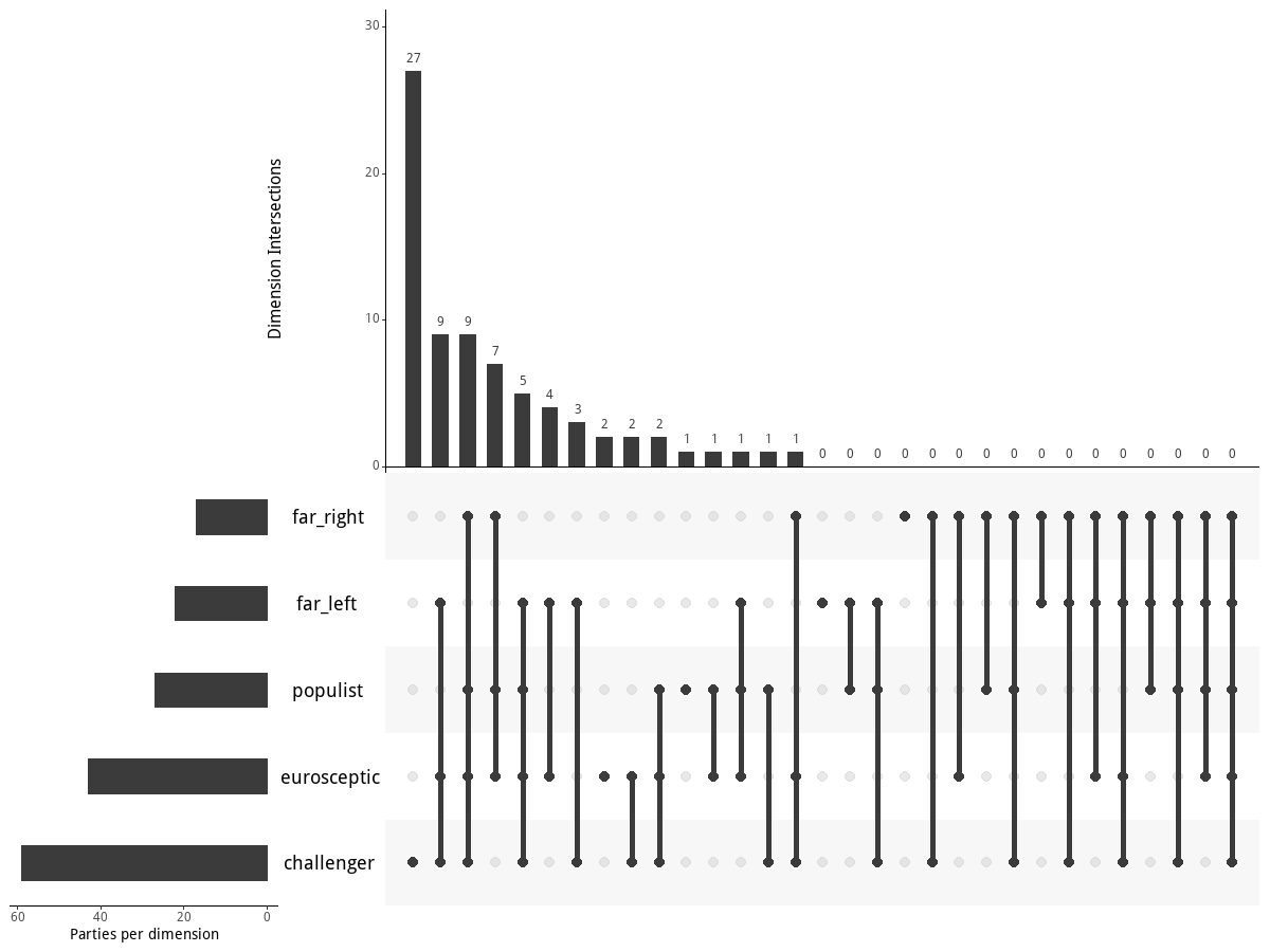
Here is what the UpSetR package does for this data. Discovering empty regions of the conceptual space is often insightful: with this package you can easily see the empty sets: combination of attributes that are theoretically possible but have no observed cases.
Replication code for the graphs in R is here. Matthijs Rooduijn and colleagues actually expanded and updated the list of political parties and used the code to produce new graphs.